

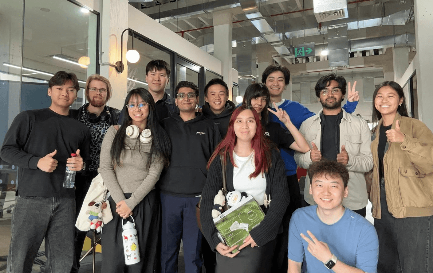
DAPPA Technologies
A virtual try-on product that started as a mobile app before pivoting to a Chrome extension after struggling with traction. I led UX/UI design across a team of 5 designers and 5 developers, shaping direction through multiple pivots before the company shut down following Google's entry into AI try-on.
Role
Lead UX/UI Designer
Timeline
Feb 2024 - June 2025
Scope
Chrome extension, onboarding, design system
Problem
Online shoppers lack confidence in fit and sizing, leading to hesitation, regret, and high return rates. There was no way to visualise how clothes would look on you before buying.
Solution
I designed a Chrome extension that let users try on clothes virtually, track prices, and get sizing recommendations, all without leaving the retailer's site.
Approach
Surveying 282 shoppers showed that fit uncertainty and lack of visual confidence were the biggest barriers to purchase.
Working in rapid build > measure > learn cycles, I focused the product around 3 pillars: virtual try-on for visualisation, price tracking to reduce hesitation, and social sharing to bring external validation into the buying process.
224 users
were price conscious
190 users
struggle with fit & quality
146 users
can't visualise style
79% of 282 surveyed shoppers were price conscious
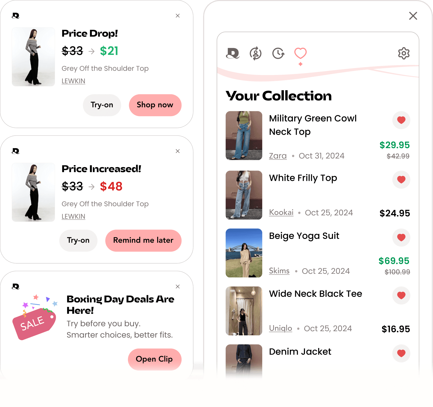
AI virtual try-on
Virtual try-on while you shop, directly in your browser.
Social outfit ratings

Wishlist and price alerts
Save items from any retailer and get
notified when prices drop.
Created the design system & handoff workflow
One of my first initiatives at DAPPA. Designers, developers, and PMs were all working from one tangled Figma file, so I built the design system, file structure, and handoff workflow that kept files dev-ready and easy to navigate.


1 messy Figma file, untangled: split, labelled, and version-logged.

Documentation for designers and devs

Mass componetised icons

Clear guidance on how to use each colour, to reduce mistakes and misuse.


Variables and tokenisation for various elements such as spacing, text, buttons etc
Challenge
The MVP worked but wasn't connecting with our female audience. The design was too minimal and generic, lacking the personality and polish needed to build trust and brand recognition. Initial usability testing also showed the 28-screen onboarding flow was the biggest drop-off point. I redesigned the flow around a few key changes.

Usability testing revealed…
Upload confusion
"So I need a full body
photo, then?"
Lost at launch
"I downloaded it but...
how do I open it?"
Discoverability
"I forgot I even had
it installed."
Created an improved sign-up flow for desktop
As we pivoted from app to Chrome extension, desktop gave us more screen space to build credibility through branding and visuals. Added a pin prompt during setup so users wouldn't lose the extension after install.
Original mobile onboarding
28 screens
Streamlined photo upload
Users didn't know what type of photo to upload. Replaced the long and old tutorial video with inline photo guides showing exact requirements, and an auto-camera with real-time capture signals to reduce guesswork.
1m 22s → 37s
Results
40% → 90%
Photo upload success
150 → 1.5k
Growth in active users
system usability score
“
Direction shifted often as the business model evolved. These features were designed, but ultimately dropped as the business model and goals changed.
B2B dashboard
Built to win over retailers. Didn't gain traction, so we pivoted to B2C.


