Toastie: Health tracking made quick, easy and informative.
STRATEGIC APPROACH + TIMELINE STRUCTURE
My PM framework: waterfall + agile structure.
PROBLEM
People with chronic diseases feel lost, trapped & hopeless, finding symptoms logging a hassle.
SOLUTION
Intuitive insights providing a holistic view, enabling data-driven decisions and self-understanding.
1. Insights hub w/ health overview and alerts


2. In-depth, yet digestible user data.
3. New Features: Actionable Page & Resources
Personalised Daily Tasks: Tailored tasks to help manage illness and build healthy habits.
Automated Alerts: Timely notifications to keep busy users on track and reduce manual tracking.
Community Support & Knowledge: Access to peer-shared tips, alternative solutions, relevant studies, and articles to foster a sense of belonging and empower informed health choices.
DESKTOP RESEARCH + ONLINE ETHNOGRAPHY + LITERATURE REVIEW
Confusing health data, increasing demand for easy, informative apps that facilitate self-care and personalised support.
COMPETITOR ANALYSIS
Competitors are good at logging, but lacked any actionable insights.
USER INTERVIEWS + AFFINITY MAPPING
Users track symptoms, but find the effort wasted due to a lack of productive outcomes.
MAIN INSIGHT
A guided, data-backed way to manage and understand their own illness is key.
PERSONA + USER JOURNEY MAP
People seek understanding & support for their condition amidst, a busy schedule.
PRIORITISATION MATRIX
Focused on empowering users with educational guidance and digestible, personalised insights with actionable outcomes.
WIREFRAMES
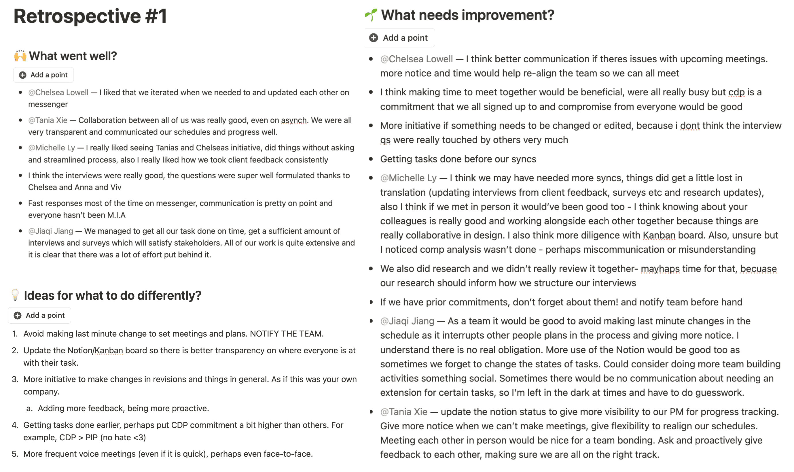
In-person hangout: crazy 8s ideation, retrospective and addressing client feedback of wireframes.
IMPROVEMENTS
Make insights useful, actionable, and visually clear.
1. Evolution of Insights Hub
Original Toastie
Our Hi-fi
My QA
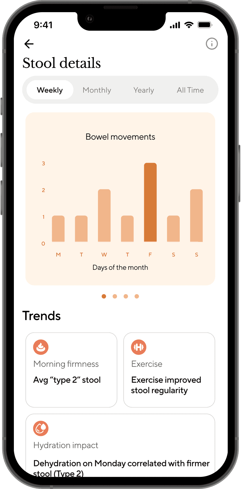
2.. Improved Symptom Analysis Page
Condensed data: Paginated tabs to prevent overwhelming users.
Structured summaries: Trends use icons and colours for glanceable information.
Balanced visual hierarchy: Toning down gradients and excessive colours, creating a more breathable feel.
Original Toastie
Our Hi-fi
My QA
3. Data Export Page
Balanced design: Using neutral colours; reduced eye strain and improved heirarchy from excessive orange usage.
Simplification: Streamlined data export by condensing elements; reduced cognitive load.
Our Hi-fi
My QA
USABILITY TEST RESULTS
Overall successful testing scores with SUS, CSAT and NPS surveys.
15 → 75/100 AVG SUS
UX/UI issues on the original Toastie insights page made it hard to navigate and overwhelming.
2/5 → 4/5 AVG CSAT
Original insights page was unsatisfactory; new design significantly improved initial user satisfaction.
1/5 → 3/5 AVG NPS
Improved user return, with potential for further gains with more iteration and promising features.
58s → 25s AVG decrease logging time
We drastically condensed and categorised the number of symptoms from 52 down to 9, resulting in a 57% decrease in symptom logging time for users.


